


Most retailers have more data than they can use and still cannot say whether last week was good. A retail KPI dashboard closes the gap. It puts the handful of numbers that drive decisions on one screen.
Below are the 15 metrics worth tracking, each with a formula, a review frequency, and a benchmark. You also get a layout for each of the four rows, a cadence table for who reviews what and when, build options from POS reporting through spreadsheets, and the metric swaps for liquor stores, smoke shops, dispensaries, and thrift stores.
Key Takeaways:
- A working dashboard holds 10 to 15 metrics, with only four to six visible before you scroll.
- Every metric needs a formula, an owner, a review frequency, and a defined action when it moves.
- Roughly 10 of the 15 come straight from POS reporting, and five need one input the register cannot capture.
- Definitions matter more than software, so settle net versus gross sales before you build anything.
What is a Retail KPI Dashboard?
A retail KPI dashboard is a single view that consolidates the performance numbers a retailer uses to run the business, pulled from point of sale transactions, inventory records, labor data, and customer history. Metrics appear as tiles, trend lines, and short tables so a manager can read the state of the store in under a minute instead of assembling the picture from four separate reports.
Nearly every retail dashboard organizes its metrics into four groups:
- Sales performance: revenue, transaction count, average transaction value, margin
- Inventory efficiency: turnover, sell-through, weeks of supply, out-of-stocks
- Customer behavior: conversion, retention, visit frequency, basket composition
- Operational execution: sales per labor hour, voids and discounts, shrink
Which retail metrics sit inside each group changes with store type and store count, but the four-group structure holds almost universally. A store performance dashboard is a narrower application of the same idea, scoped to one location and weighted toward what staff on the floor can control.
Retail KPI Dashboard vs. Retail Report
The two get used interchangeably and should not be. A report is a periodic document built for depth, generated monthly or quarterly, and read once. A dashboard is a monitoring surface built for frequency, opened on a set day and read repeatedly against a target.
Worth knowing before you build one: dashboards are descriptive by nature. They show that conversion fell 3 points last week. They do not explain why, and no amount of chart design changes that. Diagnosis stays with the operator, which is why every number on a working dashboard needs an owner and a defined next step attached to it.
Cadence decides which of the two you end up with. A dashboard opened whenever someone gets curious functions as a slow report; a dashboard opened every Monday with the same four questions becomes the way the business is managed.
Discover Advanced Analytics and Custom Reports
Speak with a product specialist and learn how KORONA POS can work for your business.
Outcome, Driver, Diagnostic: How to Pick 15 Metrics From 60
A mid-range POS can report on 60 or more distinct numbers. A dashboard should show 10 to 15 of them, with only four to six visible before you scroll. Cognitive-load research puts the ceiling at five to nine items processed at once, and most dashboards still crowd 30 or more onto one screen.
The filter is a question of function, not importance. Every metric that earns a spot does one of three jobs.
Outcomes tell you whether the period was good. Net sales against plan, gross margin rate, transaction count, inventory value at cost. Four to six of them, top row. Outcomes explain nothing on their own; they tell you whether to keep going or start digging.
Drivers explain movement in the outcomes. Traffic, conversion rate, average transaction value, units per transaction, sell-through, sales per labor hour, out-of-stock rate on top sellers. Six to eight, second layer. Drivers are where a manager spends most of the review.
Diagnostics identify the specific cause. Sales by hour, discount and void detail by cashier, SKU-level availability, return reasons, category mix, vendor fill rate. Here is the part most retailers get wrong: diagnostics do not belong on the dashboard. They are reports you open after a driver moves. Diagnostics pinned to the front screen are the most common reason a dashboard becomes unreadable.
The four subject groups above (sales, inventory, customer, operations) describe what a metric is about. The three tiers describe what it does. Every metric carries both labels. Inventory turnover is an inventory metric functioning as a driver; inventory value is an inventory metric functioning as an outcome.
The One Question That Keeps a Metric on the Dashboard
Would a 10 percent move in the number change something you do next week?
If yes, it belongs on the dashboard. If no, it is a report, and reports live one click away. Interesting is not the same as actionable.
Each surviving metric also needs a named owner. A number nobody owns becomes a topic of conversation rather than a lever someone pulls.
Worked Example: Sales Down 8 Percent
Monday review, net sales down 8 percent week over week. The outcome row has done its only job.
Check the drivers:
- Traffic: flat
- Conversion: flat at 22 percent
- Average transaction value: down 11 percent
Demand held and closing held, so the problem is basket size. Two possibilities eliminated in about 15 seconds.
Now open one diagnostic. Category mix shows premium spirits revenue down while unit count held steady, pointing at price point rather than volume. A second diagnostic, availability on top sellers, shows the three fastest-moving premium SKUs out of stock since Wednesday.
Action: reorder, then raise the reorder point on all three. Time from number to decision, under 10 minutes.
Without tiering, the same review means scanning 40 numbers in no particular order and guessing which one matters.
Why Tracking Retail KPIs Matters
A number on its own is trivia. Sales of $48,000 last week means nothing until you set it against plan, against the same week last year, and against the four weeks before it. KPIs supply the comparison, and the comparison is what turns a figure into a judgment about whether the week was good.
Most retail losses never appear as a line item. Research from analyst firm IHL Group puts the cost of out-of-stocks and overstocks at 6.5 percent of global retail sales, roughly $1.7 trillion a year. Apply the same percentage to a store doing $2 million annually, and the figure is $130,000.
Almost none of it shows up in a P&L, because a sale that never happened leaves no record. Declining foot traffic, sell-through drifting downward, and a rising out-of-stock rate on top sellers are the only places the loss surfaces early enough to do something about it.
Labor hours, shelf space, and marketing budget get allocated every week, usually on instinct. Sales per labor hour identifies the overstaffed shifts. Margin by category shows which four feet of shelf are earning their keep.
Expense data reveals where operating expenses are climbing faster than revenue, and campaign data separates the retail marketing strategies that returned something from the ones that felt productive. The same decisions get made either way. The difference is whether evidence or memory drives them.
Visible targets also change staff behavior in a way that encouragement does not. A cashier told to upsell will nod. A cashier shown that units per transaction sits at 1.8 against a target of 2.1 has something specific to move. Published numbers settle arguments too, since two managers cannot hold competing views of last month’s margin while reading the same figure.
The 15 Retail KPIs to Put on a Retail KPI Dashboard
Below are 15 metrics worth considering, split into the five outcomes and ten drivers described above. Most retailers will use 12 to 14 of them. Drop any that do not apply to your operation: conversion rate is unavailable without a traffic counter, retention rate needs customer identity at checkout, and sales per square foot means little for a store with no meaningful selling floor.
| # | KPI | Formula | Tier | Review | Typical range | Act when |
|---|---|---|---|---|---|---|
| 1 | Net sales vs. plan | (Net sales ÷ planned sales) × 100 | Outcome | Weekly | Set from your own plan | Two consecutive weeks under 95% of plan |
| 2 | Transaction count | Count of completed sales | Outcome | Daily | Own 8-week baseline | Down more than 5% year over year on comparable days |
| 3 | Gross profit margin | ((Net sales − COGS) ÷ net sales) × 100 | Outcome | Weekly | Varies by vertical; know your own floor | Down more than 1 point month over month |
| 4 | GMROI | Gross profit ÷ average inventory cost | Outcome | Monthly | 1.0 is break-even; 2.0+ is a common target; 3.0+ is strong | Any category below 1.5 |
| 5 | Sales per square foot | Net sales ÷ selling square footage | Outcome | Monthly | No useful industry average; compare against your own occupancy cost | Rent and occupancy pass 12% of sales |
| 6 | Foot traffic | Visitor count from door counter | Driver | Daily | Own baseline by weekday | Down 2 weeks running with no weather or calendar cause |
| 7 | Conversion rate | (Transactions ÷ foot traffic) × 100 | Driver | Weekly | 20% to 40% for most brick-and-mortar retail | Falls while traffic holds steady |
| 8 | Average transaction value | Net sales ÷ transaction count | Driver | Weekly | US average is roughly $56, but vertical matters far more | Down more than 5% with unit count flat |
| 9 | Units per transaction | Units sold ÷ transaction count | Driver | Weekly | Own baseline; movement matters more than level | Flat or falling for a full month |
| 10 | Sell-through rate | (Units sold ÷ units received) × 100 | Driver | Monthly, by category | 75% to 80% signals inventory matched to demand | Below 50% (overbought) or near 100% (understocked) |
| 11 | Inventory turnover | COGS ÷ average inventory at cost | Driver | Monthly | Highly vertical-dependent; grocery turns fast, jewelry slow | Any category at half your store average |
| 12 | Out-of-stock rate, top sellers | (Top SKUs out of stock ÷ top SKUs tracked) × 100 | Driver | Daily | No industry benchmark exists; set your own tolerance | Any top-20 SKU out of stock for a second day |
| 13 | Sales per labor hour | Net sales ÷ labor hours worked | Driver | Weekly | Own baseline by daypart | Peak hours underperforming slow hours |
| 14 | Shrink rate | ((Book inventory − counted inventory) ÷ net sales) × 100 | Driver | Per count cycle | 1.6% of sales was NRF’s last published figure, for FY2022 | Above 2%, or any single category doubling |
| 15 | Customer retention rate | ((Customers at end − new customers) ÷ customers at start) × 100 | Driver | Quarterly | Own baseline; segment matters more than the aggregate | Falling while acquisition spend rises |
Four of the 15 deserve a note, because they are the ones retailers most often get wrong.
GMROI: The One Metric Most Retailers Skip
GMROI answers a question neither margin nor turnover answers alone: how much gross profit does each dollar tied up in inventory return? A category can carry a healthy gross margin and still destroy value by sitting on the shelf for nine months.
Anything above 1.0 means the category generates more profit than it costs to keep in stock. Most retailers target 2.0 or better, and 3.0 or above is strong. The practical use is comparative: if two categories carry similar margins but one turns twice as fast, its GMROI is roughly double, and it has earned more shelf space and more of your open-to-buy budget.
Conversion Rate Needs a Traffic Counter
Conversion rate is the highest-value driver on the list and the one most small retailers cannot calculate, because the denominator requires counting people who walked in and bought nothing. A POS knows transactions. It has no idea how many shoppers left empty-handed.
For most brick-and-mortar retail, 20 to 40 percent is the working range. A store converting at the bottom of that band while traffic holds steady has a merchandising, pricing, staffing, or customer experience problem, not a demand problem. Hardware costs less than most retailers assume, though not as little as the cheapest listings suggest. Basic infrared beams sell for under $150 and are barely worth installing, since a single beam cannot tell direction and counts a shopping cart the same as a customer. A directional sensor you can trust runs $200 to $500 per door, and thermal or camera-based systems start near $1,500 installed.
Sell-Through Rate vs. Inventory Turnover
The two get confused constantly. Sell-through rate measures a specific batch: of the units received, what percentage sold in the period. It answers buying questions. Inventory turnover measures the whole inventory position and answers cash questions, since it tells you how many times your stock investment recycles per year.
Buy decisions run on sell-through. Cash flow and open-to-buy planning run on turnover. A dashboard needs both.
Why Net Profit Margin is Not on the List
Net margin matters enormously and belongs nowhere near a weekly dashboard. No POS can calculate it, because the inputs live in accounting: rent, payroll taxes, insurance, loan service, owner draw. It arrives weeks after the period closes, and nothing a manager does on Tuesday moves it.
Review net margin monthly or quarterly with your bookkeeper, alongside sales growth over the same span. Gross margin is the profitability figure that belongs on the dashboard, because it updates daily and responds to decisions you actually control.
A Note on the Benchmark Column
Several rows above say “own baseline” rather than giving a number, which is deliberate. Published benchmarks for units per transaction, sales per labor hour, and retention rate come almost entirely from vendor blogs recycling each other, and the ranges that do exist span so widely across verticals that comparing a smoke shop to a furniture store produces nothing usable. Eight weeks of your own data beats a borrowed average every time. Where a defensible industry range exists, the table gives it.
Retailers with a defined selling floor can baseline space productivity with a sales per square foot calculator before setting a target. The number only means something next to what the space costs, and rent below 10 percent of sales is generally read as efficient, while anything above 15 percent signals a problem. Retailers running a loyalty program already have the customer identity data that makes retention rate calculable, which is the main reason it belongs on the list at all.
What Goes in Each Row of the Dashboard
Layout is where most retail dashboards fail. The metric selection is usually defensible; the arrangement is random. A manager ends up reading 15 numbers in whatever order the software placed them and walks away without a conclusion.
Order the rows by diagnostic sequence rather than by category. Row one establishes whether a problem exists. Every row below it narrows where the problem lives.
| Row | Question it answers | What sits here | Refresh |
|---|---|---|---|
| One | Was the period good? | Net sales vs. plan, transaction count, gross profit margin, GMROI, sales per square foot | Weekly, with GMROI and space productivity monthly |
| Two | Is it demand or basket? | Foot traffic, conversion rate, average transaction value, units per transaction | Traffic daily, the rest weekly |
| Three | Is it inventory? | Sell-through by category, inventory turnover, out-of-stock rate on top sellers | Out-of-stocks daily, the rest monthly |
| Four | Is it execution or loyalty? | Sales per labor hour, shrink rate, customer retention rate | Labor weekly, shrink per count cycle, retention quarterly |
Reading the rows top to bottom reproduces the diagnostic path from earlier. Sales down 8 percent appears in row one. Row two shows traffic and conversion holding with average transaction value falling, which rules out a demand problem. Row three points at category availability. Four rows, one conclusion, under two minutes.
Every Tile Needs a Comparison
A bare number is unreadable. “$48,320” tells a manager nothing at all. Each tile in row one carries three elements and stops there:
- The figure: net sales, $48,320
- A comparison: 94% of plan, or down 6% against the same week last year
- A direction: one trend indicator, either an arrow with a percentage or a sparkline, never both
The strongest consumer dashboards follow the pattern exactly, with four cards showing a number, a trend arrow, and a small sparkline apiece. Keep labels short. The top 80 to 120 pixels of the screen is the most valuable space on the dashboard, so no welcome message, no logo band, and no date picker should occupy it.
Use Trend Lines Below the Top Row
Drivers only carry meaning as a shape over time. A conversion rate of 24 percent is neutral information. A conversion rate of 24 percent following three weeks at 31 percent is an emergency, and only a trend line shows the difference.
Rows two through four should use small multiples: same chart type, same axis treatment, same colors, 8 to 13 weeks of history visible in each. One consistent visual language means a manager learns to read the dashboard once rather than relearning every chart.
Restrict color to three states: on target, watch, off target. A fourth and fifth color strip meaning from all of them.
What Not to Put on a Retail KPI Dashboard
Three things get excluded, and the third is the one people resist:
- Diagnostics. Sales by hour, void and discount detail, return reasons, vendor fill rate. All valuable, all one click away, none on the front screen.
- Anything manual. A tile that requires someone to type a number in goes stale within two months, and the whole dashboard loses credibility alongside it. Automate the feed or leave the metric out.
- Anything without an owner and a trigger. If nobody is accountable for the number and no defined action follows a move, the tile is decoration.
Fifteen metrics, four rows, one screen. Everything else is a report.
Review Cadence: Who Looks at What, And When
Frequency belongs to the metric, not to the dashboard. Out-of-stocks on top sellers need a look every morning. Retention rate reviewed weekly produces noise, since the number cannot move meaningfully in seven days.
Assign each of the 15 a cadence and a name. Four review slots cover a single store or a small group.
| Cadence | Owner | Metrics reviewed | Decisions it feeds |
|---|---|---|---|
| Daily, 5 minutes at open | Store manager or shift lead | Transaction count, foot traffic, out-of-stock on top 20 SKUs | Floor coverage for the day, what to pull from the back, what to reorder now |
| Weekly, 30 minutes, same day each week | Owner or GM, with the store manager | Net sales vs. plan, gross profit margin, conversion rate, average transaction value, units per transaction, sales per labor hour | Next week’s schedule, promotional focus, one coaching target per associate |
| Monthly, 60 minutes | Owner or whoever buys | GMROI, inventory turnover, sell-through by category, sales per square foot | Open-to-buy, reorder points, shelf space reallocation, markdown calls |
| Quarterly, half a day | Owner, with the bookkeeper | Shrink rate, customer retention rate, GMROI trend by category, net margin | Assortment changes, vendor negotiations, pricing structure, loss prevention spend, whether the dashboard still fits the business |
What the Weekly Review Actually Looks Like
Thirty minutes, four questions, asked in the order the rows are stacked:
- Did we hit plan? Row one answers it. No discussion needed if the answer is yes.
- Was it traffic, conversion, or basket? Row two isolates which of the three moved.
- Was inventory the constraint? Row three tells you whether the product was on the shelf to sell.
- What changes before next week, and who owns the change? Nothing else in the meeting matters if the fourth question goes unanswered.
Two rules make the difference between a review and a status update. Everyone reads the dashboard before the meeting starts, so no one spends 20 minutes presenting numbers that are already on the screen. And if the group cannot name the top two or three issues by the end, the review covered too much ground.
A dashboard and a review are separate tools. The dashboard makes performance visible; the review is where decisions get made and assigned. Retailers who build the first and skip the second end up with an expensive screen nobody acts on.
One Owner Per Number
Ownership does not mean control. A store manager cannot control foot traffic, and a buyer cannot control what a supplier ships. Ownership means one named person explains the movement, coordinates the diagnosis, and brings a proposed action.
For a single store, most of the 15 will belong to two or three people. Writing a name beside each metric takes ten minutes and is the highest-return ten minutes in the whole build. Actions need the same treatment: agreed verbally and never written down is the most common way a good review produces no change.
Align Inventory Review to Your Order Cycle
The monthly slot above works for category analysis and fails for availability. A liquor store or convenience store reordering weekly cannot wait 30 days to discover a fast mover has been out for two weeks.
Split the difference. Reorder-driven checks, meaning out-of-stocks and coverage on fast movers, follow your order cycle. Category-level analysis, meaning GMROI, turnover, and sell-through, stays monthly, because the numbers need enough volume behind them to mean anything.
Operators running two to ten locations should add one cross-store comparison to the weekly slot, using the same four row-two drivers. Resist making it a ranking exercise. The useful question is not which store won but what the top store is doing that the others could copy.
How to Build Your Retail KPI Dashboard
Ten of the 15 metrics come straight out of POS reporting. Five need one piece of information your POS has no way of knowing. Sorting the list that way first saves most retailers from buying software they do not need.
Work up the ladder and stop at the rung that covers you.
Start With What Your POS Already Reports
Modern POS reporting and analytics covers most of a retail dashboard without any additional tooling. Transaction count, gross profit margin, average transaction value, units per transaction, sell-through rate, inventory turnover, GMROI, and out-of-stock alerts on fast movers all derive from data the register already captures.
Two of the ten come with a condition. Sales per labor hour requires staff to clock in through the POS rather than on paper. Customer retention rate requires customer identity at checkout, which in practice means a loyalty program or a CRM record attached to the sale.
KORONA POS produces the set through KORONA Studio, the cloud back office, with report combinations ranging from a single employee shift to a full year. ABC product analysis grades every item by sales contribution and profitability, which answers the shelf-space question faster than building the calculation yourself. Slow seller reports flag dead stock, reorder levels trigger stock notifications, and multi-location operators get cross-store comparison on the same metrics. Dashboards are customizable, so the four-row layout above can be assembled rather than approximated.
Speak with a product specialist and learn how KORONA POS can power your business.
The Five Metrics That Need an Input From Outside Your POS
No POS can calculate the following five, because each depends on information that never passes through the register. None requires new software, and four of the five are one-time setup.
| Metric | Input your POS does not have | Where it comes from |
|---|---|---|
| Net sales vs. plan | A sales plan | Your targets by week or month, entered once per period |
| Sales per square foot | Selling square footage | Measure the floor once, excluding stockroom and office |
| Foot traffic | Visitor count | A door counter or camera-based people counter |
| Conversion rate | Visitor count (same input) | The same counter; your POS supplies the transactions |
| Shrink rate | Counted inventory | Physical or cycle counts against book inventory |
Foot traffic is the only one carrying real cost, and it unlocks two of the 15 rather than one, since conversion rate is unavailable without it. Everything else on the list is a measurement, a target, or a count you should be doing anyway.
Add a Spreadsheet Layer For Anything Left Over
Retailers who want plan variance, multi-week trends, or a metric their POS reports but does not chart can close the gap with a weekly export. The approach suits single-location stores and anyone unwilling to pay for a second piece of software.
- Export, do not retype. Pull a CSV of sales by day, sales by category, and inventory on hand. Manual entry is what kills these files by month three.
- One tab per subject area. Sales, inventory, labor, customer. Keep raw exports separate from calculated tabs so a format change breaks one sheet rather than everything.
- Build the formulas once. Gross margin, GMROI, sell-through, sales per square foot, and plan variance are all a single formula each against the raw tabs.
- Chart on a summary tab. Four rows, matching the layout above. Nothing on the summary tab should require typing.
An inventory spreadsheet is a reasonable starting structure for the inventory tabs. Budget an hour to build and about 15 minutes a week to refresh.
Inventory management a headache?
KORONA POS makes stock control easy. Automate tasks, generate custom reports, and learn how you can start improving your business.
When to Move to Third-Party or BI Tools
Three conditions justify the upgrade, and none of them is store count on its own:
- Exports exceed roughly two hours a month. Labor cost has overtaken software cost.
- Sales run through more than one channel. Reconciling in-store, online, and marketplace figures by hand introduces errors faster than it produces insight.
- More than one person needs the same numbers on the same schedule. A spreadsheet on someone’s desktop does not serve a weekly review across five locations.
Dedicated inventory management software handles the stock side of the dashboard in more depth than most POS reporting, particularly demand forecasting and vendor performance. BI platforms pull from several systems at once and suit operators who have outgrown a single source of truth. Either route adds cost and setup time, so verify that retail inventory management inside your POS genuinely falls short before paying for a second system.
Manual Tracking Without a Modern POS
Retailers on a legacy register can still run a reduced dashboard. Record daily sales and transaction count from the Z-report, count visitors with a handheld clicker during sample hours, and calculate margin from invoices at month end.
Expect three or four of the 15 rather than ten, and expect the numbers to lag by weeks. Manual tracking works as a stopgap, not a destination, since the labor cost of maintaining it usually exceeds the subscription cost of a system that produces the same figures automatically.
Retail KPI Dashboard Examples
A screenshot of a dashboard teaches nothing on its own. What matters is which of the 15 metrics a given screen answers and what a manager does after reading it. Four real views from KORONA Studio, the cloud back office where KORONA POS reporting lives, mapped to the rows they feed.
Custom KPI Widgets: The Top Two Rows
KORONA Studio dashboards are built from KPI widgets, including hourly sales, average ticket size, conversion rate, and employee performance. The set covers most of rows one and two directly, which is what makes the four-row layout assemblable rather than aspirational.
Metrics answered: average transaction value, conversion rate, sales per labor hour, transaction count.
What a manager does with it: hourly sales against labor hours exposes the shifts where coverage and demand are mismatched. A store peaking at 4 p.m. with its thinnest staffing at 4 p.m. has a scheduling problem visible in about five seconds, and fixing it costs nothing.
ABC Analysis: Which Products Earn Their Shelf Space
The report grades every SKU by movement and profitability, sorting a full catalog into top sellers, slow movers, and dead stock. Manual SKU review takes weeks and produces the same answer.
Metrics answered: sell-through rate, GMROI at category and item level.
What a manager does with it: C-grade items occupying A-grade shelf positions get moved or discontinued. For a high-SKU specialty retailer carrying several thousand items, the report is the only practical route to the shelf-space question, and it belongs in the monthly review slot rather than the weekly one.
Inventory Order Report: Catching Out-of-Stocks Early
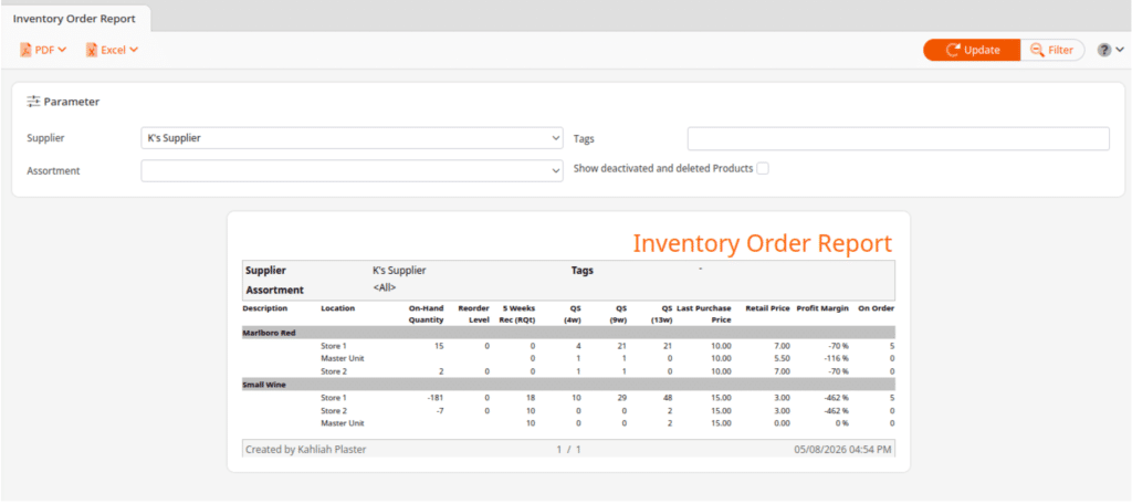
Scoped to a single supplier, the report shows on-hand quantity, units sold across the past 4, 9, and 13 weeks, a recommended five-week order quantity, and both cost and retail price on one screen. Assortment and tag filters narrow it further.
Metrics answered: out-of-stock rate on top sellers, sell-through by supplier.
What a manager does with it: the three sales columns are the useful part, because they show direction rather than a single snapshot. A product selling 40 units over 13 weeks and 4 over the last 4 is declining, and reordering to the system recommendation would overbuy it. Read the trend before accepting the suggested quantity.
Identify Irregularities: The Early Shrink Signal
The inventory function builds a list of every product sitting at negative quantity on hand. Negative stock means the system recorded sales beyond what it believed was in the building, which is a reliable indicator that inventory records have drifted from reality.
Metrics answered: shrink rate, and the data quality behind every inventory metric on the dashboard.
What a manager does with it: negative-stock items get counted first in the next cycle count. Running the list weekly costs a few minutes and catches receiving errors, mis-scans, and theft patterns months before a full physical count would. It also protects the dashboard, since sell-through and turnover calculated on inaccurate stock figures produce confident, wrong answers.
Retailers weighing options beyond their current setup can compare store reporting solutions across platforms, and anyone building out the stock side further will find more report structures in a dedicated inventory reporting guide.
Retail KPI Dashboards by Store Type
The core 15 hold across most of retail. Each store type below replaces two or three of them with metrics that matter more in that format.
Liquor Stores
Liquor stores need velocity tracked by size within a SKU, case-break margin, and shelf return by category. A 750ml and a 1.75L of the same label are different products with different turns and different margins, so SKU-level sell-through hides the answer a buyer needs. Case-break margin determines whether selling singles from a broken case beats moving the case intact. Most liquor store traffic is anonymous, so drop retention rate unless a loyalty program is running.
Smoke And Vape Shops
For tobacco and vape retailers, the additions are scan data capture rate, age-verification exception rate, and SKU count against turns. Capture rate, meaning eligible transactions actually submitted, is money rather than housekeeping. Tobacco scan data pays per transaction, and effective January 1, 2026, Altria’s AGDC restructured its Digital Trade Program into four tiers, tightening Tier 2 and Tier 3 requirements. Tier 2 requires Age Validation Technology at the point of sale, which makes age-verification exceptions a question of rebate eligibility rather than solely a legal one. A smoke shop carrying several thousand SKUs also needs SKU count tracked against turns, since dead inventory hides easily at that catalog size.
Convenience Stores
A convenience store needs sales by daypart, foodservice waste rate, and basket attach rate. The format runs four or five distinct businesses inside one day, so daypart sales replace plain transaction count on the top row. Prepared food carries the best margin and the only meaningful spoilage, which is what puts waste rate on the dashboard. Attach rate on fuel-to-inside trips or drink-plus-snack combos is where basket growth comes from. Scan data capture applies here as much as it does in smoke shops.
Dispensaries
Dispensaries should put traceability reconciliation variance, transaction time, and sales per visit ahead of anything on the general list. Compliance metrics come first in a regulated market. A monthly package-level spot check comparing ten random Metrc or BioTrack packages against POS inventory catches drift early, and repeated adjustments filed under the same reason code point at a receiving or weighing process problem rather than isolated mistakes. Transaction time matters because purchase-limit enforcement adds steps at checkout that no other retail vertical deals with. Use sales per visit rather than per customer, since medical and adult-use markets label the same buyer differently, and a dispensary operating in both needs one metric covering both.
Thrift And Resale Stores
Resale operations run on intake-to-sale days, sell-through by intake week, and markdown cycle performance. Nothing gets reordered, so SKU-level sell-through and reorder points have no application. Track cohorts instead: of everything processed during the week of March 3, what percentage sold and how long did it take. GMROI also breaks for donation-based operations, because inventory cost sits near zero and the ratio stops meaning anything. Sales per square foot and intake-to-sale days carry the weight in a thrift store instead.
Four Definition Traps That Break Retail Dashboards
Sales is the most visible number in retail and the most commonly misread. A dashboard where two people define sales differently does not produce disagreement about strategy. It produces disagreement about arithmetic, which is worse, because the meeting stops being about the business.
Settle four questions before building anything.
Gross Sales, Net Sales, Tax In or Tax Out
Gross sales counts everything rung up. Net sales removes returns, discounts, and allowances. Either can be reported with tax included or excluded, which yields four different answers to “what did we sell last week.”
Use net sales excluding tax as the standard everywhere. Analysts who build retail reporting systems recommend the same default, and for good reason: it is the cleanest view for management decisions, it matches what your accountant works from, and it keeps margin calculations honest. Whatever you pick, one definition has to apply across the dashboard, the P&L, and every conversation about performance.
Which Period a Return Lands In
A January sale returned in February can be handled two ways. Restating January reduces the original period and keeps product-level accuracy intact. Absorbing it into February leaves history alone and charges the current period.
Neither is wrong, and both distort something. Restating means last week’s number changes after you have already discussed it. Absorbing means a heavy return week looks like a demand problem when it is not. Pick one, write it down, and check which one your POS does by default rather than assuming.
Discounts Treated as Lost Sales or Lost Margin
Selling a $40 item at $30 can be recorded as $30 of sales or as $40 of sales with $10 of discount. The first depresses average transaction value. The second protects it and shows the cost in the margin line instead.
The distinction matters most for stores running frequent promotions, because a dashboard using the first method makes a successful promotional week look like a basket problem. Employee discounts and comped items need the same decision.
Gift Cards and Loyalty Redemptions
A gift card sale is not revenue. Money changes hands, but nothing has been sold yet, and the amount sits as a liability until someone redeems it. Counting the sale twice, once at issue and again at redemption, inflates sales and distorts margin in both periods.
Loyalty redemptions raise the same question. A $5 reward applied at checkout is either a discount against that sale or a cost carried elsewhere. Choose before the dashboard is built, since fixing it afterwards means rebuilding history.
Multi-location operators need one more definition: comparable sales, which excludes new openings, closures, and stores that changed format significantly. Without it, opening a location looks like growth that existing stores did not earn.
Why Most Retail Dashboards Stop Getting Opened
Dashboards rarely fail because the metrics were wrong. They fail for five reasons, in roughly descending order of frequency:
- Too many metrics. Thirty numbers on one screen means no number gets read.
- Manual updates. A tile someone has to type into goes stale inside two months, and credibility goes with it.
- No owner. A number nobody is accountable for becomes a talking point.
- No cadence. Opened when someone gets curious, a dashboard is just a slow report.
- Definitions nobody agreed on. Once two people bring different figures to the same meeting, the dashboard is finished.
Every one of the five is a design decision rather than a software limitation. A dashboard with 12 metrics, named owners, a fixed review day, and one agreed definition per number survives. Most of the rest get abandoned by month three.
FAQ: Retail KPI Dashboard
What is a Retail KPI Dashboard?
A retail KPI dashboard is a single view showing the performance metrics a retailer reviews on a fixed schedule to decide what to do next. It draws from point of sale transactions, inventory records, labor data, and customer history, presenting them as tiles, trend lines, and short tables. The purpose is monitoring against a target rather than analysis, which separates it from a report.
What Should be Included in a Retail Sales Dashboard?
Between 10 and 15 metrics across four areas: sales performance, inventory efficiency, customer behavior, and operational execution. A working set includes net sales against plan, transaction count, gross profit margin, GMROI, sales per square foot, foot traffic, conversion rate, average transaction value, units per transaction, sell-through rate, inventory turnover, out-of-stock rate on top sellers, sales per labor hour, shrink rate, and customer retention rate. Diagnostic reports such as sales by hour or void detail belong one click away, not on the dashboard itself.
How Many KPIs Should a Retail Dashboard Have?
Ten to 15 in total, with only four to six visible before scrolling. Cognitive-load research puts the limit at five to nine items a person can process at once, and most dashboards crowd in 30 or more. The filter is whether a 10 percent move in the number would change something you do next week. If not, it belongs in a report.
How Often Should You Review a Retail KPI Dashboard?
Frequency belongs to the metric rather than the dashboard. Store managers should check transaction count, foot traffic, and out-of-stocks on top sellers daily, in about five minutes. Owners review sales against plan, margin, conversion, basket metrics, and labor productivity weekly, in about 30 minutes. Inventory productivity metrics such as GMROI, turnover, and sell-through go monthly, and shrink and retention quarterly.
Can You Build a Retail KPI Dashboard in Excel?
Yes, and for a single location it is often the right answer. Export sales by day, sales by category, and inventory on hand as CSV files, keep raw exports on separate tabs from calculated ones, build each formula once, and chart on a summary tab. Budget roughly an hour to set up and 15 minutes a week to refresh. The approach fails when someone has to type numbers in manually, since those files go stale within a couple of months.
What is the Difference Between a Retail KPI And a Retail Metric?
A metric is any number you can measure. A KPI is a metric with a target, an owner, and a decision attached to it. Sales by hour is a metric. Conversion rate against a 25 percent target, owned by the store manager and reviewed every Monday, is a KPI. Most retailers track plenty of metrics and surprisingly few KPIs.
Does a POS System Come With a KPI Dashboard?
Most modern POS systems include reporting and dashboard tools, and around 10 of the 15 core retail KPIs come straight from POS data. Five need one input the register cannot capture: a sales plan for plan variance, selling square footage for space productivity, a visitor count for foot traffic and conversion, and physical counts for shrink. Four of those five are one-time setup, and only the visitor count carries real cost, since it requires a door counter.