
Planning a retail space might seem to be lower on your priority list. After all, there are so many other things that new business owners have to consider: rent, products, pricing, inventory management, promotions, customer loyalty, retail operational software, and so much more.
Though all of those are important items to consider, it doesn’t mean that you should be ignoring your retail store floor plan. Experts have spent decades analyzing the minutia that go into creating both the best experience for the customer and the most profitable for the merchant. Planning your retail floor space correctly can have a huge impact on your total sales.
So, whether you’re thinking about opening a new store or revamping an existing one, this blog will dive into some of the best retail floor plans. It doesn’t have to be a daunting task, either. Remember, in retail, small changes can go a long way. Learn more below.
Figure Out Your Store Floor Plan
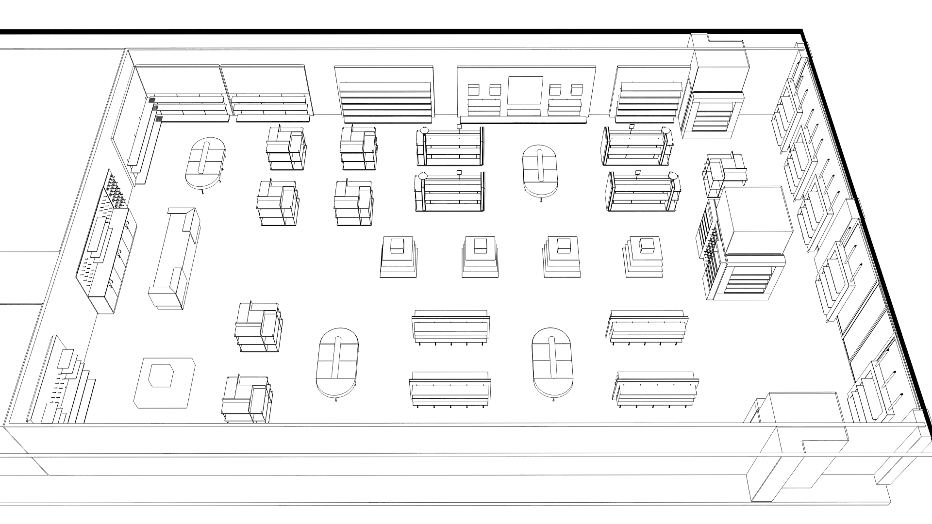
Retailers have a lot of options for different types of floor plans. Most of you are familiar with the philosophy that the customer should always be led to the right side as soon as they walk in. But beyond that, what are some of the most popular retail floor plans?
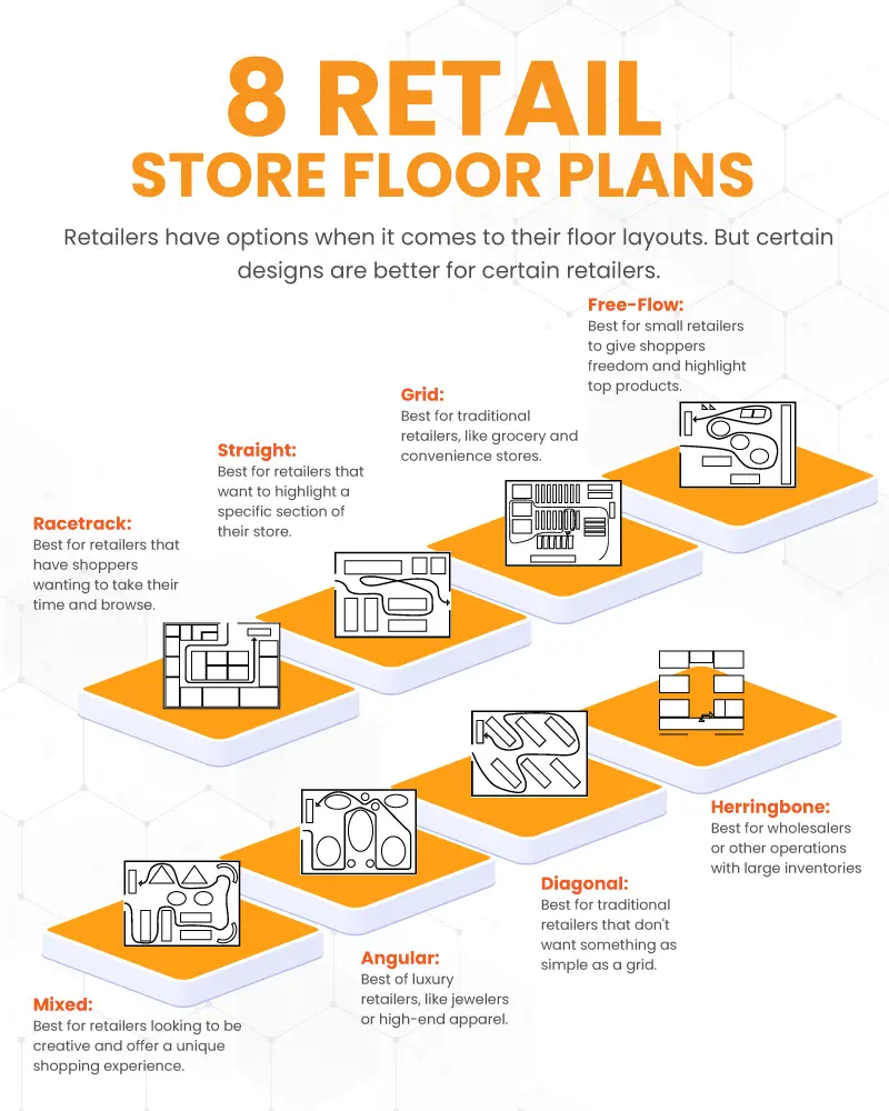
Free-Flow Retail Layout
Let’s start with the one that requires the least planning. A free-flow plan gives retailers the most options for how they design their store layout. This is great for owners who want more flexibility and creativity.
The idea is to let shoppers explore the floor at their own speed and in their own direction. There is no attempt to guide them in any certain way.
It’s good for retailers looking to open boutique shops and other small stores. This design helps your products stand out more, gives shoppers more space, and is well-suited for high-end retail.
Still, free-flow plans make it hard to plan your product placements and can lead to confusion among your shoppers, so plan accordingly.

Grid Floor Plan
Moving from the most unconventional to the most conventional, grid floor plans are the go-to for most traditional retailers. This plan is straightforward and will be the most familiar to shoppers.
Grid floor plans are an efficient use of space, too, maximizing the amount of real estate for showcasing your products. They make stocking and inventory management easier so your team can get routine tasks done quickly.
It does, however, present the most boring of any floor plan. In an age when shoppers are seeking uniqueness out of their experience, a grid retail plan is far from inspiring. It can also be overwhelming, cramped, and inconvenient to find items.
Straight Retail Space
Similarly, a straight retail layout is easy to plan and keeps things simple. It opens traffic to siphon shoppers towards a certain part of the store, usually the back.
This presents an opportunity for retailers to create a featured section where they can promote new arrivals, special promotions, or other merchandising.
Like the grid plan, though, a straight retail floor space can be rather one-dimensional and leaves little to the imagination of the customer.
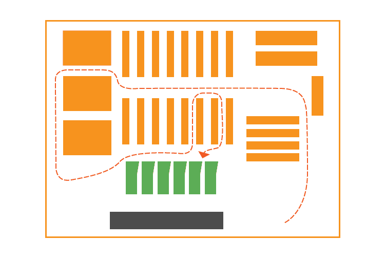
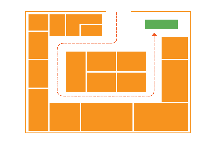
Racetrack Layout
Also known as a loop layout, the racetrack floor plan helps guide the customers’ journey. It helps lead the shoppers without sacrificing the feeling of freedom to roam.
This system helps merchants expose the maximum number of products available. It also makes for a predictable customer path, making it better for placing strategic promotional material and displays along the way.
It’s better suited for retailers with a large floor space where more traditional layouts might be insufficient. But be careful to only use it if your customer base likes to browse. The loop layout isn’t great for the in-and-out shopper. Some retailers might consider combining a racetrack layout section with a more traditional, broader store layout.
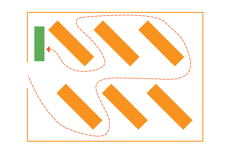
Herringbone Floor Design
The herringbone layout is one of the more unusual floor plans, but one that certain merchants would be smart to take note of.
This layout is similar to the grid but is a better option for stores that are long and narrow. These are typically wholesale warehouse types of stores or other operations that have a lot of products without a lot of space, like you might see in some of the older, large bookshops.
The downside of herringbone layouts is that they minimize product visibility and can often feel packed in a cramped space.

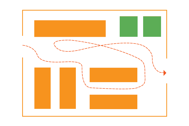
Diagonal Store Map
Another slight variation on the grid format, diagonal floor plans simply turn the aisles at an angle to help improve product exposure and open up the space.
This is great for smaller retailers that want to free up sightlines and create a more unique space. It’s even better for facilitating movement throughout the store and creating better circulation among the guests.
The only downside of this layout over the grid layout is that it prevents shortcuts between sections and isn’t quite as familiar to the average shopper.
Angular Retail Floor
Most similar to the free-flow pattern, angular layouts rely heavily on stand-alone displays. Most often, these include circular designs or rounded tables.
Typically, this design is best suited for high-end retail, such as jewelers, fashion apparel, cosmetics, or luxury accessories.
Angular floor plans do not maximize space and are thus not a good fit for merchants with large levels of inventory. Instead, they offer a good opportunity to show off a handful of unique items.

Geometric/Mixed Store Design
Lastly, brick & mortar shops can use an approach more integrated into their floor space. Geometric layouts incorporate the existing structural design of walls, windows, pillars, etc. into the shopping experience.
Similarly, a mixed space combines different elements of various floor plans into one. This is great for retailers that sell different types of merchandise in a single location.
IKEA, for instance, combines a forced path/racetrack layout with a herringbone. Grocery stores often combine traditional grid layouts for their staples with angular or free-flow plans in their specialty departments.
Overall, this layout takes the most planning, but it also brings shoppers a customized experience and gives retailers more flexibility and creativity.

How to Decide on the Right Retail Floor Plan
So far, we’ve covered some of the most popular retail layouts. And while that section should have given you some idea of what’s a good fit, there are a few other factors to consider as you go through this process. The items below will help you zero in on the best solution for your store.
Think About How Your Shoppers Behave
There are a lot of fascinating facts surrounding consumer behavior and psychology.
For instance, the decoy effect helps retailers add perceived value and set higher prices for certain items. Additionally, it’s been proven that the real estate just inside your front doors (decompression zone) is the most important for highlighting promotions. Shoppers are also more likely to head to the right upon entering your store.
Think about what makes the most sense for your shopping experience. Ask for customer feedback, take the constraints of your physical location into account, and test out different solutions with temporary layouts.
Hire a Store Layout Planner
Before trying to build anything in your store, make sure that it’s going to work. You don’t want to be halfway done building your floor plan only to find out that it won’t fit correctly.
Start by drawing a few sketches of what you’re envisioning. Remember some of your basic infrastructure, like electrical outlets, built-in appliances, and your POS checkout area.
Most of us aren’t architecturally trained, but luckily there are a few digital tools available to make this part easier. These allow you to draft up basic floor plans and play around with different variations.
If you’re looking for inspiration, follow some relevant accounts on Pinterest or Instagram. These can help business owners discover new ideas.
Finally, for bigger spaces or multi-store operations, it might be worth investing in outside consul. Look for agencies that specialize in developing retail layouts and maximize your space efficiency.
Clear Out Your Entryway
The space right inside your front doors is referred to as the decompression zone. It’s some of the most important space in your entire store. It’s a critical area because it gives your shoppers their very first impression of the inside of your space. Here, allow them the space to gather their surroundings and quickly understand how to proceed.
This area of the retail space is also a great opportunity to place standalone promotional displays or other simple merchandising.
Keep the Your Retail Store Floor Plan Clean
While you want to maximize how many products you showcase, you don’t want to overwhelm your shoppers or add confusion to the shopping experience.
Consumers appreciate having more white space in a store. It allows people to take their time through the space without having to worry about blocking other shoppers. Plus, psychologically, it’s associated with luxury. After all, retail real estate is a luxury!
If you truly market towards the budget shopper, you can afford to cram things in a little more but still not at the risk of adding too much annoyance.
With enough white space on your retail floor, you can also slow down some shoppers with displays along the way to remind them of items they forgot they needed or introduce them to products they didn’t know you had.
Highlight these with good lighting, lots of color, big signage, and movable displays (in case a certain location isn’t working).
KORONA POS is very user-friendly. You can customize the interface to conform to your business needs. Customer Service is in the United States, always accessible, and always awesome. We love that we can fit it into our scale of business and grow with it.
-Darlene P.


Get the Right Hardware for Your Retail Space
Once you decide on a plan, make sure you stock it with the right materials. These include a whole array of items, including your displays, shelving, and racks. But it also must include your retail checkout area.
Creating a seamless checkout experience with the right POS hardware will ensure that your customers leave your store on a great final note. To learn more about getting the best retail POS system, click below.