
Which Retail Floor Plan Is Right for Your Store? Take the Quiz
Retail Design Tool
Find Your Ideal
Retail Floor Plan
Answer 5 quick questions and we’ll recommend the layout that fits your store, your customers, and your space.
Question 1 of 5
Your Recommended Layout
Free-Flow Layout
Your store is built for browsing, and a free-flow layout lets customers wander and discover at their own pace. This is the layout of boutiques, lifestyle brands, and curated gift shops — places where the shopping experience itself is part of the appeal.
Why this fits you
You’re working with a curated inventory, customers who want to explore, and a space that rewards an open, premium feel.
Watch out for
Free-flow only works with strong curation. Without intentional product placement and visual merchandising, the layout can feel disorganized rather than inviting.
Your Recommended Layout
Grid Layout
Your customers come in with a list, and a grid layout helps them find what they need fast. Parallel aisles, maximum density, easy navigation — this is the workhorse layout for grocery stores, pharmacies, convenience stores, and any retailer with a high SKU count.
Why this fits you
You’re carrying a lot of inventory, your customers are mission-driven, and operational efficiency matters more than experiential design.
Watch out for
Grid layouts are functional but not inspiring. If you want to add discovery, consider mixing in angular or open displays for higher-margin or featured products.
Your Recommended Layout
Straight (Spine) Layout
A single main aisle down the center of the store, with displays branching off on either side. The straight layout works when you want to deliberately guide customers toward a destination — usually a featured section, high-margin product, or back-of-store area.
Why this fits you
You want control over how customers move through your store without locking them into a full loop. Your inventory is moderate and your goal is to direct attention.
Watch out for
Customers may not explore side displays as much as you’d hope. Cross-merchandising along the spine helps capture impulse purchases.
Your Recommended Layout
Racetrack (Loop) Layout
A defined path that guides shoppers through your entire store and back to the entrance — think IKEA. The racetrack maximizes exposure to your full assortment, which is exactly what you want for a large-format store or any retailer who wants browsers to see everything.
Why this fits you
You have the floor space to support a defined path, a wide assortment you want fully explored, and customers who are open to browsing.
Watch out for
Goal-oriented shoppers can find loops frustrating. Build in shortcuts or clear signage if you have a meaningful share of mission-driven customers.
Your Recommended Layout
Herringbone Layout
A central spine with angled aisles branching off in a herringbone pattern. This layout is purpose-built for long, narrow spaces with high SKU counts — wholesale stores, large bookshops, warehouse-style retailers.
Why this fits you
Your store is narrower than it is wide, you carry significant inventory, and you need to maximize aisle density without sacrificing navigation.
Watch out for
Angled aisles create visual dead zones. Place high-priority and high-margin products along the central spine where visibility is strongest.
Your Recommended Layout
Diagonal Layout
A grid rotated 45 degrees. Aisles run at an angle, opening up sightlines from the entrance and creating better visibility across the store. This is an underused layout that works particularly well for small to mid-size specialty retailers.
Why this fits you
You want the organizational benefits of a grid with stronger visual appeal. Your space is small enough that sightlines matter, and your customers are a mix of browsers and quick visits.
Watch out for
The angled aisles are slightly less space-efficient than a true grid, and the layout can feel mildly disorienting to customers who expect standard parallel aisles.
Your Recommended Layout
Angular Layout
Standalone, freestanding displays — often rounded or curved — that showcase each product individually. The angular layout is built for luxury and premium retail: jewelry, high-end cosmetics, fashion accessories, premium electronics.
Why this fits you
Your products are premium and meant to feel special. Your inventory is curated, your space is boutique-sized, and the experience around each product matters as much as the product itself.
Watch out for
Angular layouts don’t scale to large inventories or high-volume retail. If you grow, you’ll likely need to introduce grid or straight elements for non-featured product categories.
Your Recommended Layout
Geometric (Mixed) Layout
The most flexible answer — combining two or more layout styles within one store, often dictated by the architecture of the space itself. Flagship stores, multi-department retailers, and architecturally interesting spaces all benefit from this approach.
Why this fits you
Your store has unique architectural features, your inventory spans multiple categories or price points, or you’re investing in experiential retail. A single rigid layout would underuse your space.
Watch out for
Mixed layouts are the most complex and expensive to execute. Every zone needs intentional purpose — without that, the result can feel chaotic rather than curated.
Key Takeaways:
- Your store layout directly shapes how long customers stay, what they notice, and how much they spend.
- Browsers and mission-driven buyers behave differently. The best floor plan is the one built around how your customers actually shop.
- Simple things like rearranging key fixtures, clearing your decompression zone, or adding strategic white space can meaningfully improve traffic flow and sales.
The moment a shopper enters your store, your floor plan nudges them left or right, slows them down or speeds them up, puts certain products in their path, and hides others entirely. A good retail store floor plan can make or break sales every day, so it's something to consider early and often.
Here are the eight most effective retail store floor plans, what they're best for, and how to pick the one that fits your store.
The 8 Retail Store Floor Plan Types
Retailers have a variety of floor plans to choose from. While many of you know the strategy of guiding customers to the right side immediately upon entry, let's get into some of the most common (and effective) retail floor plan layouts.
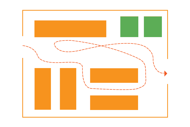
1. Free-Flow Layout

The free-flow layout is exactly what it sounds like: no enforced path or rigid aisles, just open space where customers explore at their own pace. Fixtures and displays are arranged organically, often with a mix of tables, racks, and pedestals.
Best for:
- Boutiques, high-end apparel, gift shops, and lifestyle brands where the browsing experience is part of the appeal.
Pros:
- Encourages exploration and impulse purchases
- Creates a relaxed, premium atmosphere
- Gives you maximum flexibility to rearrange seasonally
Cons:
- Harder to manage product placement strategically
- Can feel disorganized if not executed carefully
- Less efficient use of square footage
In a nutshell
Think of the free-flow layout as the one that says, "take your time; wander; get lost awhile." For a beautifully curated boutique, this is a very fitting option. For a busy convenience store, it's a tougher sell.
2. Grid Layout

Walk into any grocery store or pharmacy, and you're standing in a grid layout. Parallel aisles run from the front to the back of the store, maximizing floor space and making restocking straightforward.
Best for:
- Grocery stores, convenience stores, hardware stores, dollar stores, and any retailer with a large SKU count.
Pros:
- Maximum product density (more SKUs per square foot)
- Familiar and easy for customers to navigate
- Simplifies inventory management and restocking
Cons:
- Not an inspiring shopping experience
- Can feel cramped and impersonal
- Difficult to create visual interest or brand moments
In a nutshell
The grid layout is the workhorse of retail floor plans. It's not glamorous, but for high-volume, needs-based shopping, it's hard to beat in efficiency.
3. Straight (or Spine) Layout
The straight layout runs a single main aisle down the center of the store, with secondary displays branching off on either side. It funnels shoppers toward the back of the store, a useful trick for placing high-margin or destination products where customers must walk past everything else to reach them.
Best for:
- Specialty retailers, beauty stores, and smaller shops where you want to control the customer journey without a full loop layout.
Pros:
- Easy to plan and execute
- Naturally draws customers toward featured back-of-store sections
- Works well for cross-merchandising along the spine
Cons:
- Less flexibility than free-flow
- Can feel one-dimensional, especially in narrow spaces
- Customers may not explore side sections
In a nutshell
The straight layout is simple, deliberate, and effective. If you want customers to end up somewhere specific, this gets them there.
4. Racetrack (Loop) Layout
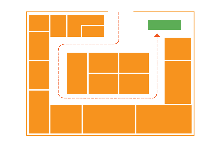
The racetrack layout (also called a loop layout) creates a defined circular or rectangular path that guides shoppers through the entire store before returning them to the entrance. IKEA is the textbook example: you follow the arrows whether you want to or not.
Best for:
- Large-format retailers, furniture stores, home goods stores, and any merchant with a wide assortment they want customers to fully explore.
Pros:
- Maximum product exposure — customers see nearly everything
- Predictable path makes it easy to place promotional displays strategically
- Reduces the chance of entire sections being ignored
Cons:
- Can feel forced or manipulative to savvy shoppers
- Frustrating for goal-oriented shoppers who want in and out quickly
- Requires significant floor space to work well
In a nutshell
The racetrack layout offers exposure for your full assortment, but only works if your customers actually want to browse. Know your shopper before you commit to the loop.
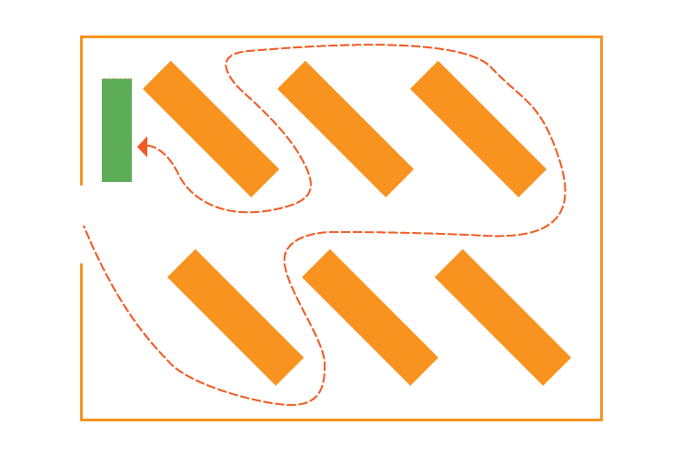
5. Herringbone Layout

The herringbone layout adapts the grid concept for long, narrow spaces. Instead of parallel aisles running end to end, a central spine runs the length of the store with angled aisles branching off in a herringbone pattern.
Best for:
- Wholesale stores, large bookshops, and warehouse-style retailers that have a lot of product and limited width.
Pros:
- Efficient use of narrow, elongated spaces
- Maintains some of the organizational benefits of a grid
Cons:
- Minimizes product visibility (angled aisles create visual dead zones)
- Can feel congested if the space is tight
- Less intuitive for customers to navigate than a true grid
In a nutshell
The herringbone layout is a specialized solution for a specific problem. If your store is wide and open, there are better options.
6. Diagonal Layout
Think of the diagonal layout as a grid that's been rotated 45 degrees. Aisles run at an angle rather than straight across the floor, which opens up sightlines, improves visibility across the store, and creates better traffic flow.
Best for:
Small to mid-size specialty retailers, beauty supply stores, and shops where product visibility is important.
Pros:
- Dramatically improves visibility from the entrance
- Encourages circulation throughout the store
- Creates a more dynamic, interesting environment than the standard grid
Cons:
- Eliminates corner shortcuts that customers expect from grid layouts
- Slightly less space-efficient than a straight grid
- Less familiar, which can mildly disorient some shoppers
In a nutshell
For a smaller retailer who wants the organizational benefits of a grid with better visual impact, the diagonal layout is often an underused option worth considering.
7. Angular Layout

The angular layout relies primarily on standalone, freestanding displays — often rounded or curved — rather than fixed shelving. Products are showcased individually or in small groupings, emphasizing the item itself rather than the volume of inventory around it.
Best for:
- Luxury retail: jewelry, high-end cosmetics, fashion accessories, premium electronics, and anywhere the product experience matters as much as the product itself.
Pros:
- Creates a premium, editorial atmosphere
- Focuses customer attention on individual items
- Works beautifully with high-margin, low-volume inventory
Cons:
- Inefficient use of space — not viable for large inventory counts
- Display fixtures can be expensive
- Doesn't scale well beyond boutique-sized stores
In a nutshell
If you're selling 10 pieces of handmade jewelry versus 1,000 pairs of socks, the angular layout helps each product command the attention it deserves.
8. Geometric (Mixed) Layout

The geometric layout integrates the architectural features of the space (columns, windows, alcoves, irregular walls) into the store design rather than working around them. A mixed layout takes it a step further, combining two or more floor plan styles within a single store.
Best for:
- Flagship stores, multi-department retailers, stores in unique or architecturally interesting spaces, and any brand investing heavily in experiential retail.
Pros:
- Maximum flexibility and creativity
- Allows different departments to have distinct identities within one store
- Creates memorable, Instagram-worthy moments that drive word of mouth
Cons:
- Most complex and expensive to execute
- Requires careful planning to avoid visual chaos
- Harder to replicate across multiple locations consistently
In a nutshell
Grocery stores often do this well: grid layouts for staple aisles, open angular displays for specialty and prepared foods. The key, though, is intentionality. Every zone should have a reason for its design.
How to Choose the Right Floor Plan for Your Store
Knowing the layouts is the easy part. Choosing the right one requires careful consideration of your store's specific context. Here are the factors that matter most.
Know Your Shopper First
Every layout decision should start here. Shoppers fall into two camps: browsers (explorers who want to discover) and mission-driven buyers (they know what they want and they're in a hurry). Browsers respond to free-flow, angular, and racetrack layouts. Mission buyers need the familiar logic of a grid or straight layout.
Most stores have both, which is why mixed layouts are so common. Design for your dominant customer type first, then accommodate the rest.
Work With Your Space, Not Against It
Your store's shape and size should heavily influence your layout choice:
- Narrow and long → Herringbone or straight
- Small and square → Free-flow or diagonal
- Large and open → Racetrack or mixed
- Architecturally interesting → Geometric
Fighting your physical space is expensive and usually loses.
Test Before You Commit
Before building permanent fixtures, sketch out your ideas and test them with temporary displays. Low-cost mockups let you see how traffic actually flows, identify blind spots, and get a feel for sightlines before you've invested in permanent infrastructure.
Digital floor plan tools make this even easier. Apps like SketchUp or dedicated retail planning platforms let you map your space accurately and experiment with different configurations in minutes.
PRO TIP!
If you're opening a large format or multi-location retail concept, bringing in a professional retail designer or store planner is worth the investment. A specialist can help you avoid costly mistakes and optimize your layout for both customer experience and operational efficiency.
Don't Forget the Checkout Area
Your POS checkout area is the last impression a customer has before leaving. Regardless of your floor plan choice, your checkout counter should be clearly visible, accessible, and designed to reduce friction at the end of the shopping journey.
For many store types, placing the checkout toward the front-left of the store works well — it's naturally where customers end up after instinctively moving right through the space.
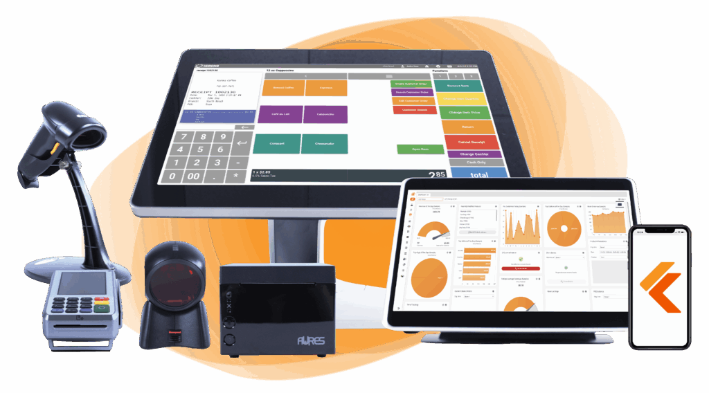
Build Your Own POS
Whether you run a retail store, café, or admissions booth, we have the point of sale hardware designed for your specific needs. Start building your ideal POS system now.
A Few Rules That Apply to Every Layout
- Leave a decompression zone. The space just inside your entrance is where customers adjust to the new environment. Keep it open and don't cram it with permanent fixtures. Use it for high-impact seasonal displays instead.
- Turn right. Shoppers instinctively move right after entering a store. Account for this in where you place high-priority products and promotions.
- White space sells. Overcrowding your floor signals discount retail. Strategic open space slows customers down, improves product visibility, and communicates quality, even in budget stores.
Quick Reference: All 8 Layouts at a Glance
| Layout | Best For | Key Strength | Key Weakness |
|---|---|---|---|
| Free-Flow | Boutiques, lifestyle brands | Encourages browsing | Needs strong curation |
| Grid | Grocery, pharmacy, c-stores | Maximum product density | Low experiential appeal |
| Straight | Specialty retail, beauty | Controls customer journey | Can feel one-dimensional |
| Racetrack | Large format, furniture | Maximum exposure | Frustrates quick shoppers |
| Herringbone | Narrow/warehouse spaces | Fits tough floorplans | Limited visibility |
| Diagonal | Small–mid specialty | Better sightlines | Slightly less efficient |
| Angular | Luxury, jewelry, cosmetics | Premium atmosphere | Not scalable |
| Geometric/Mixed | Flagships, multi-department | Maximum creativity | Most complex to execute |
The Bottom Line on Retail Store Floor Plans
Your floor plan is an evolving, ongoing lever for growth. The best retailers revisit their layout regularly, testing small changes and measuring the impact on dwell time, conversion, and average order value.
Getting it right doesn't require a massive renovation or a big budget. Start with your customer, work with your space, and let the data tell you what to adjust from there.

Free printable templates and checklists to help you manage retail operations with ease
FAQs: Retail Store Floor Layout
How much does it cost to design a retail store layout?
It depends heavily on store size and scope. A basic DIY layout using digital planning tools (many of which are free or low-cost) can run under $500. Hiring a professional retail designer typically starts around $1,500–$5,000 for smaller stores and can run significantly higher for large-format or multi-location projects.
How often should retailers update their floor plan?
Most retail experts recommend a meaningful layout review at least once a year, with smaller seasonal adjustments every quarter. Major refreshes make sense when you're adding a new product category, noticing consistent dead zones in traffic flow, or seeing declining dwell time and conversion rates.
What's the difference between a floor plan and a planogram?
A floor plan is the macro layout of your store. A planogram is the micro-level guide to how products are arranged within a specific fixture or shelf: which items go where, at what height, and in what quantities.